
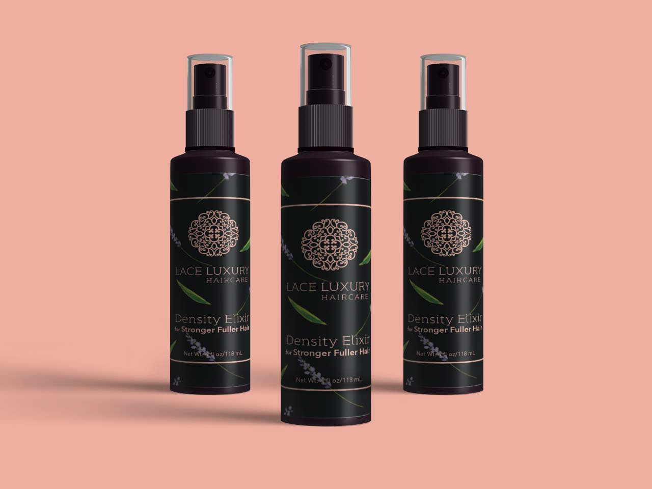
Lace Luxury Haircare creates luxury multi-functional, feel good haircare products. For their second product launch, they wanted to keep their existing high-end look while incorporating imagery depicting the natural ingredients found in the product, in this case aloe & lavender. After iterating between photography and various illustration styles, we landed on a simple watercolor look. The graphic elements and type are a rose gold foil against a matte label, ensuring that the copy and logo pop against the patterned background.
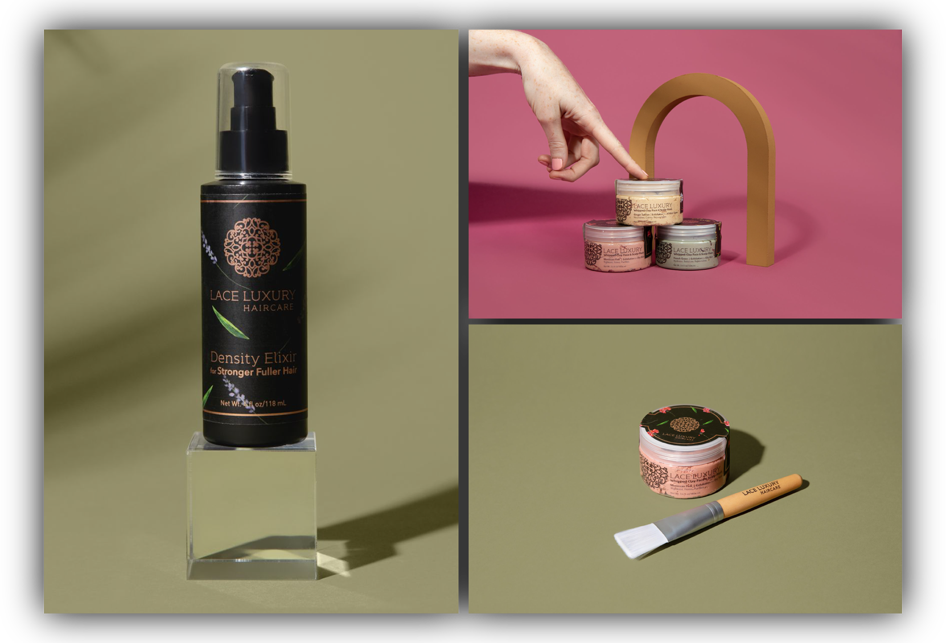
They added a line of face, scalp, and hair masks as well.
This was a completely different container shape than we’d used before, short and wide rather than tall, so our existing label system wouldn’t work. I led the creative strategy and production planning for a three-label solution:
• A clear front label to let the product color show through, using contrast for visual impact
• A custom lid label with side “wings”, printed with the same materials and design language as the bottles
• A bottom label for ingredients and compliance information
Each label was a different shape and material, but together, they created a cohesive and beautiful extension of the product line.